Logo design case study
X-Ray
X-Ray is one of the longest operating fitness clubs in Kielce. Its owner contacted me with a question about the possibility of redesigning their current logo. As a person who loves any physical activity, I had the pleasure to train there in the past and also an occasion to meet many great people, which is why this project got me really excited!
About
My job was to design a logo with a modern look and legible design, and at the same time to keep a part of the original along with the entire history of the club. Subtle changes according to the times, but the core idea will remain the same.
2004
2019
Process
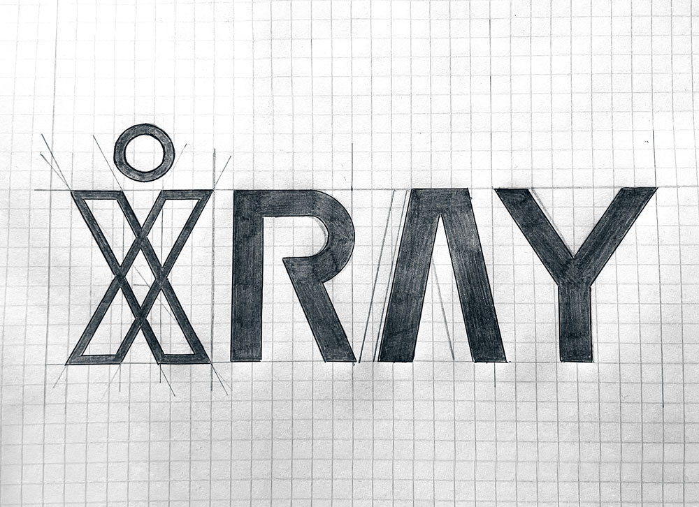
I started with custom mark, which would still be the letter X. Compared to the previous logo, where the letter X contained a jumping man symbolizing active life, I decided to combine both of these elements into one, i.e. make a man out of the letter.
Then I started to prepare the rest of the letters. I wanted to make them look more readable than my predecessor by keeping the thickness and height the same, but keeping similar shapes.


Construction
Colors
#1B1B3B
#5DEB96
Application
Feedback
After completing the project, the club owner admitted with a clear conscience that the new logo met all his expectations. Mostly, he was afraid of a complete change compared to its predecessor, but as he himself admitted:
“It’s perfectly balanced. In some way it looks very similar to the previous one, but completely different at the same time”
Redesigning the logo for X-Ray was one of the most pleasant tasks for me. We managed to keep the “soul” of the predecessor and at the same time adapt it to the next (hopefully fruitful) years of the club’s activity.


