UX/UI Case Study
Sanybite is a small Sandwich shop located in the centre of New York City. It’s main goal is to provide healthy and tasty sandwiches that are offered in a competetive pricing. Sanybite was created for people who don’t have time for preparing their own meals, but would like to stay on track with their dietary goals by customizing their chosen sandwich.


Info
The process
About
Nowadays, taking care of your own health has become a significant element in the life of every human being. Unfortunately, some of us have trouble maintaining healthy eating habits and physical activity due to other more important activities that are also time-consuming. In such situations, taking care of your health goes to the background and you are usually forced to eat some fast food in order to quickly satisfy your hunger. Sanybite was created for such people, to help them quickly order a meal while maintaining their dietary goals.

Problem
Due to the sheer volume of responsibilities, people do not have time to prepare their own meals. For this reason, they are forced to order quick, ready meals, which do not always allow them to maintain the previously set nutritional goals for the sake of their health.
Goal
Designing an application that will allow customers to personalize the product of their choice or create a completely new one, which will fit into their dietary needs and will allow them to place an order in a quick and easy way
Research
User
To understand users and their needs I conducted interviews and created empathy maps. A main user group identified through research was working adults who don’t have time to. This user group confirmed my basic assumptions about Sanybite customers, but by research I also discovered that time was not the only obstacle that was limiting users from cooking at home.
Some of them had difficulties to get the groceries required for cooking, other ones have different activities which they prefer doing after work instead of cooking or they just prefer to eat in a restaurant, because of lacking skills in cooking.
Persona
Jennifer
24 years old, HR Management Student based in New York
“I want to have a possibility to order healthy food which I can easily customize to my needs”
Jennifer is a Human Resources Management student with a very tight schedule. In her free time, she loves to travel around the world. She is also a person who likes to stay in a good shape. It is very difficult for her to find a platform that offers healthy food which fully fits her dietary needs. Due to the lack of free time to prepare meals every day, Jennifer would like to be able to order healthy food with ingredients customization.
Goals
– Find a job in HR company,
– Maintaining a good shape ,
– Make best memories by traveling the world,
– Reduce the time on social media to focus more on health, education and work.
Frustrations
– “It is difficult to find a healthy customizable pickup options near my place”,
– Staying in good shape for the whole time,
– Not enough free time for cooking own food.

Pain points
Structure
User flow
Wireframes
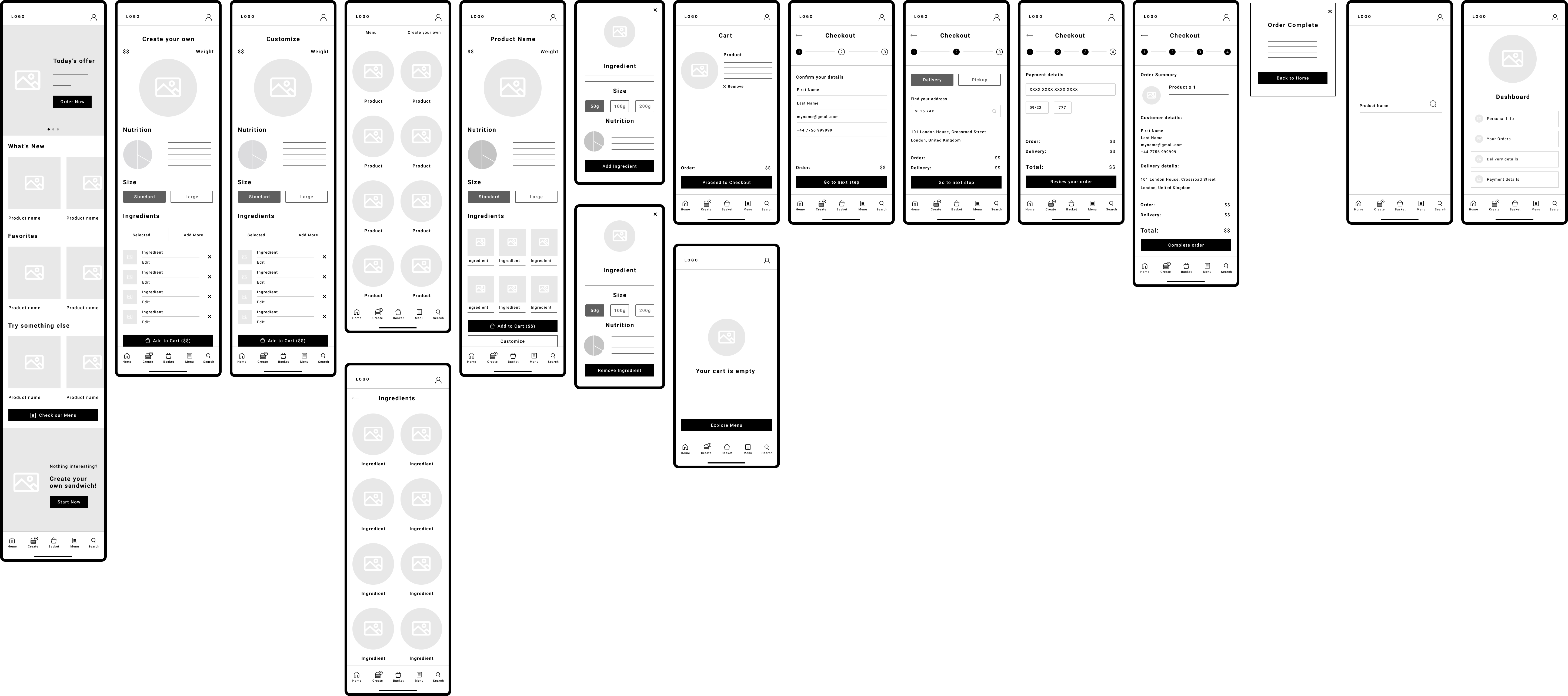
Drawing wireframes of each application screen helped me ensure that the designed elements in the digital version were well-suited to solving user problems. After my research I wanted to be sure that screens are based on users feedback and findings.
After connecting all digital wireframes, I created a low fidelity prototype, which allowed users in the primary flow to browse the menu, create their own sandwich, customize other products and make an order
Testing
Usability study
I’ve done two rounds of usability studies. First one allowed me to move on from wireframes to high-fidelity prototype. The second study udone after creating ahigh-fidelity prototype allowed me to understand which parts of mockup still needs to be improved.
Round 1
Research questions
- How much time user needs to create an account ?
- Is the checkout process clear and easy to follow ?
- Are users able to easily customize their product?
- Was there anything unclear for users while they were using the app?
Participants
- 3 female and 2 male participants, between 16 – 53 years old.
Methodology
- Around 15 minutes per participant
- Poland / United Kingdom – Remote
- Unmoderated type of usabiity study
- Users were asked to complete the tasks in Low Fidelity prototype.
Round 2
Research questions
- Is the checkout process clear and easy to follow ?
- Were users able to ?
- Was there anything unclear for users while they were using the app?
Participants
- 3 female and 2 male participants, between 16 – 53 years old.
Methodology
- Around 15 minutes per participant
- Poland / United Kingdom – Remote
- Unmoderated type of usabiity study
- Users were asked to complete the tasks in High Fidelity prototype.
Findings
Round 1
- Working adults are to busy to prepare their own meals.
- Icons from the bottom menu need to have more information, so users can clearly understand their purpose.
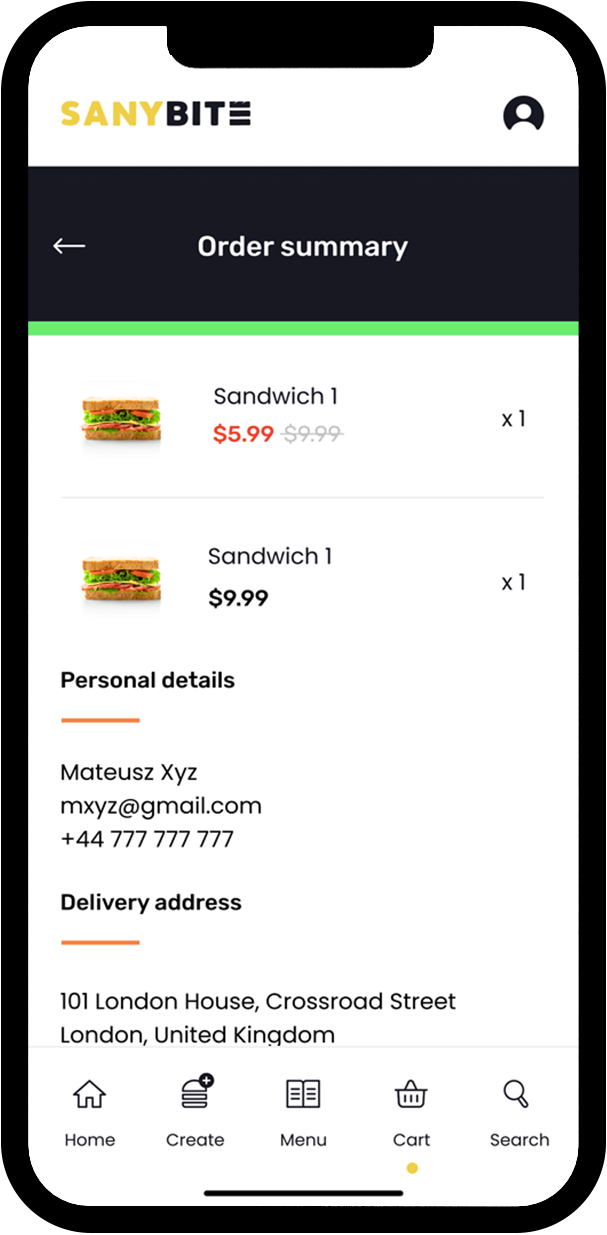
- Users need to have a view in their order before completing the checkout.
Round 2
- Not enough payment options
- Customizing and Creating own product is confusing –looks the same.
Branding
Typography
Poppins
ABCDEFGHIJKLMNOPQRSTUVWXYZ
abcdefghijklmnopqrstuvwxyz
1234567890
Poppins
ABCDEFGHIJKLMNOPQRSTUVWXYZ
abcdefghijklmnopqrstuvwxyz
1234567890
Colors
#181823
#DCDCDE
#FFFFFF
#EFCF48
#F58445
#EF452E
Logo
Design
Icons
Mockup
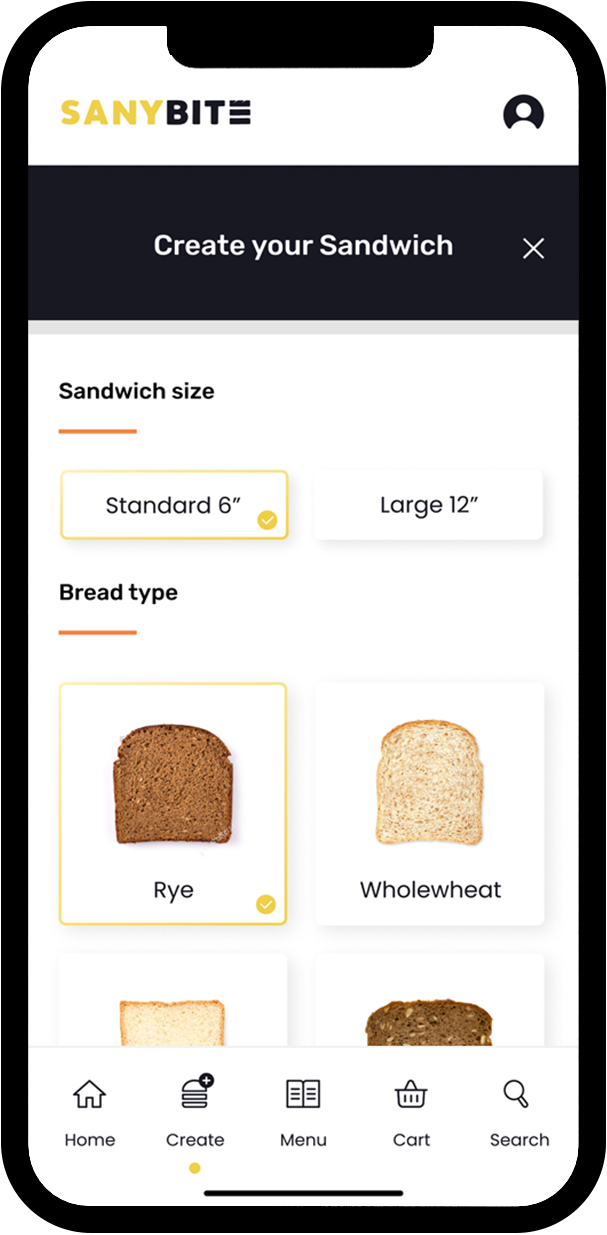
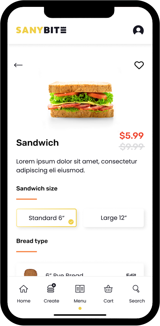
In earlier design, I created a customization button which will take you to the whole new page where you can customize the whole sandwich, which looked like Sandwich creator page and it was a bit confusing for the users, as they wasn’t sure if they are customizing selected sandwich or creating a new one. That’s why I decided to go with customization for each ingredient by pressing on it. It will open an overlay with customization options.
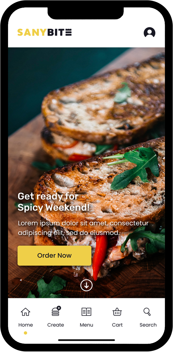
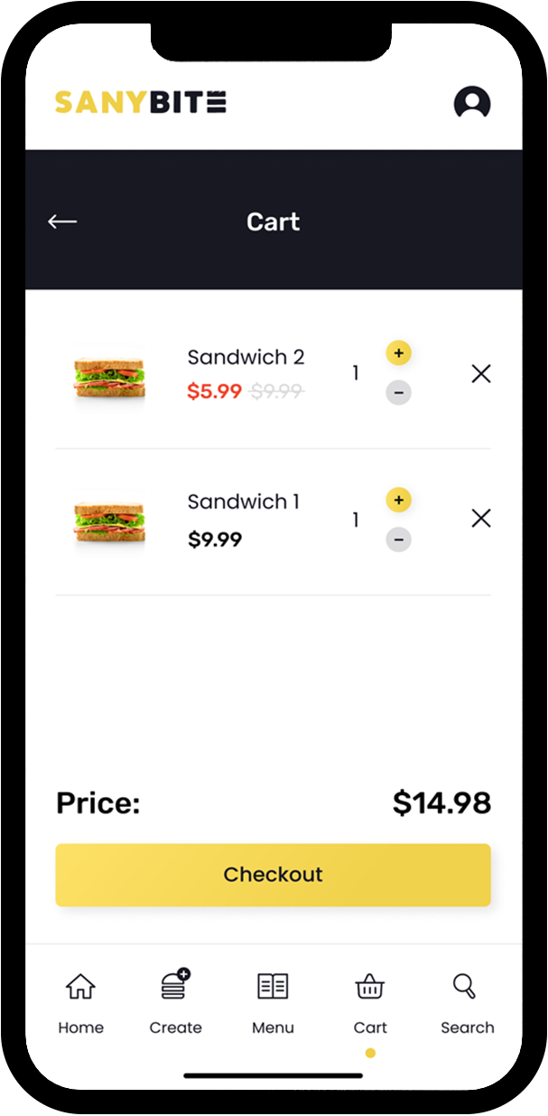
Myfinal high-fidelity prototype presented cleaner user flows for customizing the product and for making an order. It also met user needs like other payment methods and less confusing sandwich customization.
Going forward
Accessibility considerations
1
Adding access to users who are vision impaired through adding alt text to images for screen readers.
2
Adding icons to buttons and Top Menu items, to make navigation easier for users.
3
Improving animation on some elements so users will easier notice that action is done.
Takeaways
Impact
Designed application have a really positive feedback, especially because of clean and easy to follow sandwich customization and creation options.
Quote from feedback
“App is amazing! Beautiful and easy to follow! Finally, I can clearly see what I eat and how much calories it has! I would definitely use it!”
What I have learned
Most important thing that I learned while designing this App, is that everyone is different! And things that I may like may not gonna work with someone else. Usability studies and each feedback had big impact on my way of thinking and on the app’s design.
Next steps
1
Run another round of usability studies to make sure that pain points users experienced in previous designs were effectively addressed.
2
Do more user research to determine any new areas of need.
